Case Study: Muse

About the Project
Timeline: 10 weeks
Role: UX & UI Designer and Researcher
Tools Used: Sketch, InVision, ProtoPie
Platform: iOS
Problem Space
Cultural institutions provide a one-way and one-dimensional experience, where visitors passively view art and only engage on a superficial level.
Visitors are frustrated by a lack of information and feel little connection with a piece; they also avoid current attempts to engage via technical solutions due to past negative and lacklustre experiences.
The Challenge
Promote and create more meaningful interactions with art for gallery visitors in order to improve engagement.
Design Solution

Muse offers in-depth exploration of artworks by providing insider insights, historical context and analysis of different elements of the artwork. Leveraging augmented reality and beacon technology, Muse also helps visitors navigate the gallery.
To view a key flow of the app, please view the Invision prototype.
For more information about my process, please see below.
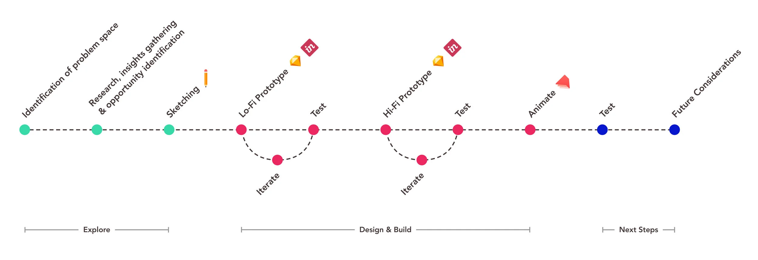
Process Overview
Below is a high level overview of the process taken as I developed the Muse prototype. During the development of the prototype, the low fidelity version was tested twice, as was the high fidelity version, in Invision. Next steps are to test the animated prototype, as well as to address the opportunities outlined at the end of this case study in the Future Opportunities section.
Research
When initially considering the problem space and challenge, I undertook both primary and secondary research in order to understand more about the existing landscape of digital solutions and their reception, as well as the first hand experience of gallery visitors. Through this research, I developed a better understanding of the challenges visitors experience, as well as what they felt would have improved past experiences.
Research Objectives
Learn how gallery visitors have previously engaged with art while visiting an art gallery
What channels (e.g. audio guide, apps, wall placards, etc.) visitors have used in the past to engage with the art and what their experience was using them
Uncover what visitors felt would have improved past gallery experiences
Research Methods
Primary Research
Five interviews were conducted with individuals that had visited a gallery in the last year and that had used gallery resources to interact with and learn about the art, such as audio guides, tour guides, wall placards and apps.
Secondary Research
Secondary research was conducted in order to understand the current landscape of digital solutions for galleries and glean insights into their current tools, offerings and metrics, such as other apps, audio guides, wall placards and tour guides.
Research Insights
Secondary Research Insights
Current digital solutions generally do not offer the level of information, context or personalization that gallery visitors are seeking
The most common digital solutions galleries use include: purchasing an off the shelf solution, riddled with advertisements and invitations to pay more to access additional content; or custom solutions which are high production value, but expensive and require external support
The Cleveland Museum of Art has studied the reception of their custom app. They have found that:
76% of participants agree that their app enhanced visitors’ overall museum experience, and
74% agreed that it encouraged them to look more closely at art and notice new things
Interview Insights
Visitors found the current gallery resources to be clunky, low production value, not always useful and unsanitary
Users sought greater insight into the artworks through context and understanding of the era, the artist and their methods
Users want to access content on their personal devices
Visitors want recommendations regarding what to see and to be guided to the pieces
Persona: Lucie Gagnon
A persona was created to reflect the data and insights obtained during user interviews and the research.

“Art is my passion and I visit galleries regularly. I love to learn about the pieces and artists, as it helps me engage with the art.”
Persona Biography
Lucie is passionate about culture and the visual arts. She frequents galleries both at home and when she travels, to learn more about the people and culture around her. She is hungry for more context and information.
Goals
Learn more about art and feel more engaged at a gallery
Experience art in a personalized way, including what information is accessed
Frustrations
Crowds at galleries are a challenge as Lucie finds it hard to see the art and read placards, which hinders her enjoyment
Lucie wants more context and information about pieces: influences, artist biography and process, but also something a bit unexpected
Lucie wants to be able to access information through her personal device; she knows how to use it and finds it more sanitary than using a gallery device
Experience Map
Through the development of Lucie’s persona, the experience of gallery visitors became clearer, and through the creation of the left experience map I was able to develop a greater understanding of Lucie’s experience from before she visited the gallery through her time at the gallery and finally her post-visit experience.
As you can see, there are many opportunities to improve Lucie’s gallery experience. The greatest opportunities lay in providing:
A content rich digital solution via a visitor’s personal device
Greater analysis and context of the work
Tours and recommendations
Guided wayfinding
The area of opportunity that I decided to focus on is providing greater context and information about a work of art.
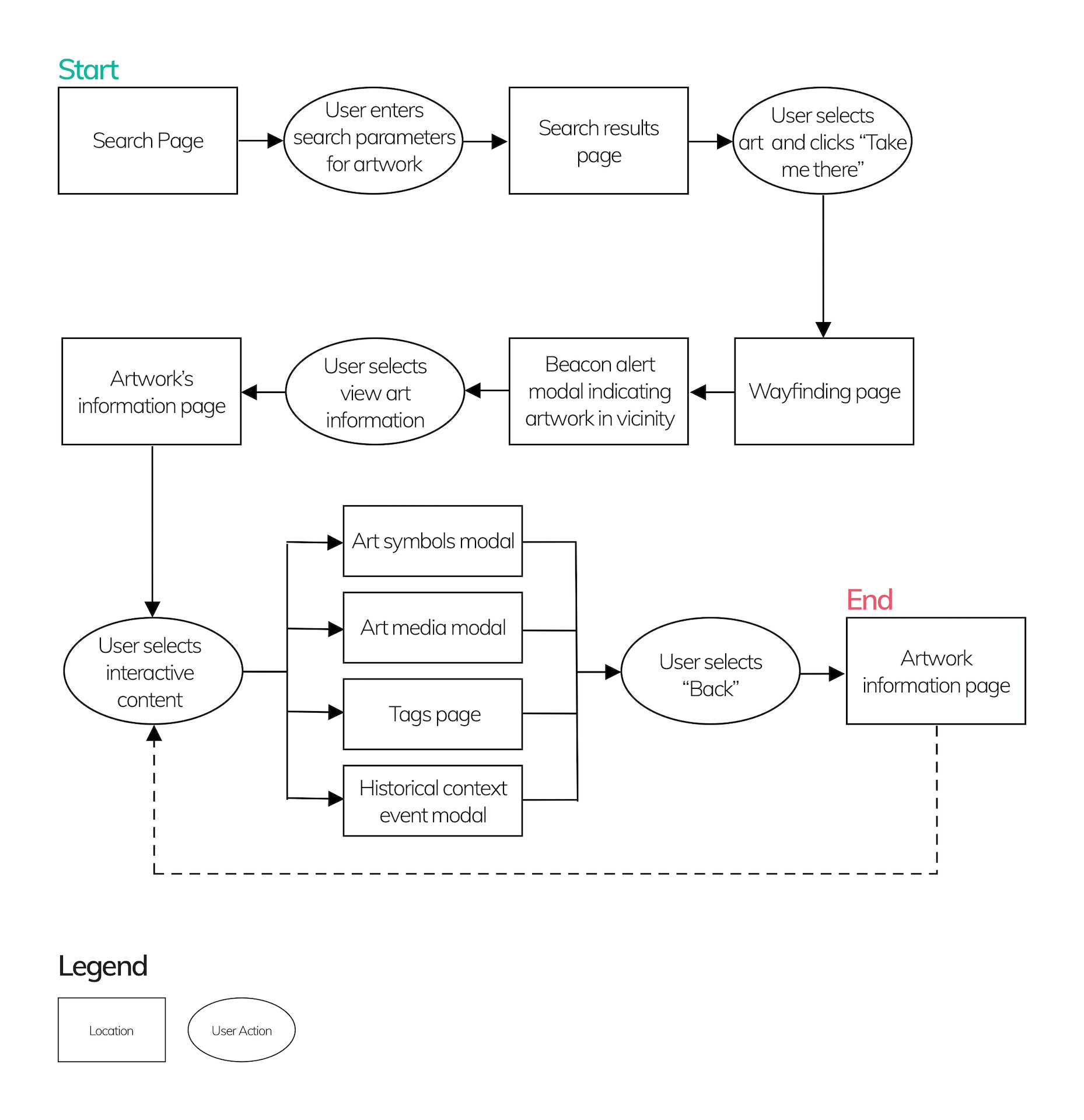
Task Flow

As indicated above, the research and resulting persona and experience map indicated that one of the greatest opportunities was to provide greater context and information about a work of art. As such, the primary focus of the task flow was to provide greater context and information to Lucie, allowing her to choose the information and interaction she was was seeking, at her own pace.
To the left is the first version of the task flow, which allowed for the user to search for an artwork and review its information for greater context with regards to the artwork, the artist and the time period.
Ideation
Once I had determined the opportunity and I had drafted a task flow, I sketched a variety of options for different screens and interaction points.


Above you will find some of the initial sketches created through crazy 8s. And to the left, are two of the sketches from which the digital wireframes were created.
Artwork’s information page
Visitors wanted more context and information, which is provided in a central location on the artwork’s information page (left). The layout and functionality was modelled after Netflix: the page scrolls down, with carousels, as such the functionality is familiar to users.
Timeline
The timeline (right) is key functionality to providing greater context. It was designed to have the feel of a dial, and scrolls up and down. The user can keep the device in a portrait justification, while using this feature for ease of use.
Digital Wireframes
The following wireframes were created using Sketch, leveraging the hand drawn sketches as reference.

Usability Testing
The above wireframes were used in order to complete usability testing in Invision. Below is a summary of three of the most significant concerns which were raised and addressed across three rounds of user testing.

“Why am I taking a picture?”
The initial task flows involved the user scanning the artwork with their device’s camera in order to access the artwork’s information. Users did not understand what was happening, or felt that holding their device in front of an artwork was awkward and uncomfortable, both physically, and due to social norms.
The prototype was changed to match users mental models and feel more comfortable. Muse integrated more traditional search functionality and static images they could hold lower in front of them. The changes were positively received.

“But where is the artwork?”
Initially the task flow did not provide guidance related to finding an artwork in the gallery, which was found to be a miss during user testing. As such, a wayfinding component leveraging AR and beacon technology was added to enhance usability and better responds to the steps visitors generally follow in a gallery.
In addition, the wayfinding feature provided an opportunity to recommend artworks to users. This addition met the desire expressed by some during interviews and was an appreciated feature during testing.

“What’s a timeline? And what does ‘Read An Artwork’ mean?”
Generally users were confused by the “Timeline” section of Muse. They did not understand what it was or how to use it. For the third version of the wireframes, the name of this section changed to “Historical Context” which users found much more intuitive; as well, the timeline format was changed: it now sits on the art information page, and it is a carousel leveraging cards as buttons; users now intuitively knew how to interact with it.
“Read an Artwork” was also confusing for users. They did not understand what the section would provide them or or how to use it. The name of the section was changed to “Art Symbols” and a short description was added to the homepage. Additionally, the functionality of the dots was made clearer through first labels and in the final version, animation.
Updated task flow
As a result of the usability testing, the task flow was updated. As mentioned in the previous section, the significant changes included:
Removing the functionality to search for an artwork or view its symbols by scanning an artwork with a device’s camera. Now, to search for an artwork, a visitor is provided a traditional search page. These updates better meet the users mental model of how to search, as well as needs related to personal comfort.
A wayfinding component was added in order to support visitors in finding an artwork in the gallery, as after searching for an artwork, that is the next step in a visitors experience. The wayfinding leverages AR and beacon technology, and provides the added benefit of being able to recommend artworks en route.
Rather than being a separate page, the timeline was moved to the main artwork page. The new format, which leverages a carousel of cards, felt more intuitive to users, as the functionality is similar to that of Netflix and other areas of Muse. It also had the additional benefit that users were more likely to continue to engage with the content below, rather than exiting to another task.
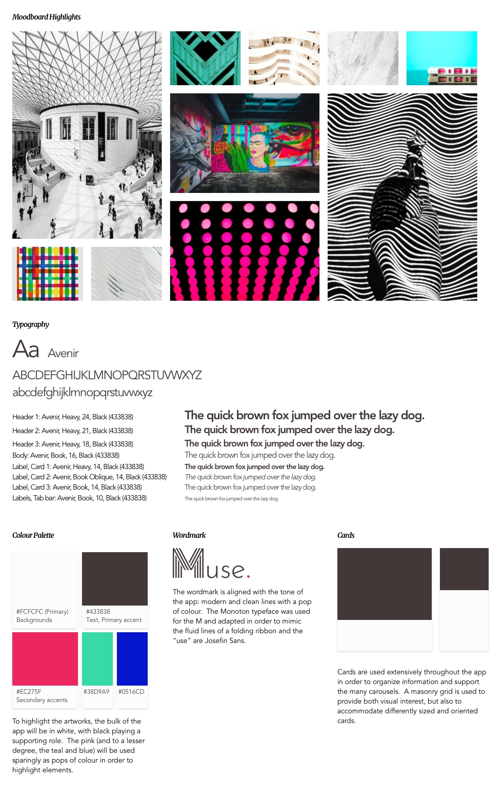
Visual Identity
When contemplating the mood and brand of Muse, the physical space of the gallery, and what it would embody were considered: modern and graphic, perhaps even stark, with clean lines. Mainly white and black, with a few pops of colour (mainly from the art). As Muse is to support the gallery visiting experience, the art is the star.
High Fidelity Prototype
The below are screenshots from the last version of the high fidelity prototype. The green arrows indicate the flow of the prototype.

Key Features
Taking into consideration Lucie’s goals and frustrations, as well as the identified opportunities, the following key features were included in Muse:

Historical Context
Lucie is seeking more context about an artwork: the artist’s life, their process, their time in history. As such, Muse seeks to provide additional details and insider insights, including estimated prices, rumours and other details. One of the key features is the historical context timeline, which provides details about the time that the artwork was produced, such as historic events, art movements and innovations that were influential to the art community at the time.

Art Symbols
Art Symbols is another feature that supports Lucie’s desire to learn more about an artwork and its context. This feature highlights different elements of an artwork in order to provide more details regarding its significance, from symbolic meaning to what influence the artist.

Wayfinding
When Lucie visits a gallery she wants to know where she can find different pieces, as well as be provided recommendations regarding what to see.
Wayfinding is a common mental model for cultural institutions. Through research, a number of organizations that leverage AR based wayfinding were discovered, such as airports, to provide routes and guidance to visitors. These were used as inspiration for the wayfinding component of Muse.
Marketing Site

As Muse was designed to be a platform sold to galleries, Muse’s website is focused on promoting Muse to galleries.
Like the app, the tone of the marketing site is sophisticated and cultured. It leverages a number of gallery photos in order to help galleries’ administrative staff and boards to see their gallery as a Muse partner gallery. It demonstrates business and visitor value in order to encourage galleries to become Muse partner galleries.
Alternate Platform: Tablet

Muse was designed to be used in galleries by visitors, as such, when presented with the alternate platform challenge, a tablet version seemed the obvious choice. However, when considering the challenge, the question became: how else do visitors behave in a gallery? Often visitors will roam a gallery without a route in mind. How can we better support those visitors?
The developed concept uses AR and beacon technology to recommend artworks to roaming visitors, and provide a teaser of information.
Future Opportunities
Had I had more time, the next task flow I would build is the tour task flow. This task flow supports the initial objective of engaging users, by encouraging users to actively think about and select what they want to see before starting their exploration of the gallery. The tour functionality could also leverage the AR wayfinding functionality by calculating the best routes and recommended artworks that are nearby.
During the initial interviews, many people indicated their frustrations with gallery crowding. This is something that I considered including in my Muse task flow; however, this is a project that could be explored and developed on its own and could have wider reaching applications even beyond visiting a gallery.
Accessibility
Muse addresses accessibility in two senses: it allows for individuals to access information in the format that works best for them, at their own pace, on their own device. While more testing is required with regards to some of the image overlays, the majority of the text is AA compliant.
The second, is that this prototype has the ability to make art more accessible and understandable for all individuals visiting a gallery—even those without degrees in art history. The feedback I received from a variety of users is that they felt they would use an app such as Muse, and that it would help them feel more confident and engaged when visiting a gallery and interacting with artworks.
Design Impact & Reflection
As a society, we spend a great deal of time on our devices. While the intention of the original art salons and exhibitions was to show art and critique it, it was also to interact with the others in attendance in order to discuss and socialize. Muse, while satisfying the desire to have information about the art pushed to one’s phone to support engagement, a future iteration could consider providing an outlet to encourage users to interact and engage with not only the art, but also the other gallery visitors around them to encourage more social engagement.