Muse
A UX Case Study

Problem Space
Cultural institutions provide a one-way experience, where gallery visitors passively view art and only engage on a superficial level. Visitors are frustrated by a lack of information and feel little connection with a piece. They avoid engaging via technical solutions due to past negative experiences.
Guiding design question
How might we create more meaningful interactions with art for gallery visitors in order to improve visitor engagement?
About the Project
Timeline: 10 weeks
Role: UX & UI Designer and Researcher
Tools Used: Sketch, ProtoPie
Platform: iOS
Solution
Muse offers an in-depth exploration of artworks by providing insider insights, historical context and analysis of works of art. Leveraging augmented reality and beacon technology, Muse also helps visitors navigate galleries.

Process Overview

Research
Research Objectives
Learn how gallery visitors have previously engaged with art while visiting a gallery
Discover which channels (e.g. audio guide, apps, wall placards, etc.) visitors use to engage and their experience
Uncover what visitors felt would have improved past gallery experiences
Learn about the existing landscape of digital solutions and their reception
User Interviews
Five individuals that visited a gallery in the last year and that had used resources (e.g. audio guides, apps, etc.) to interact with and learn about the art were interviewed.
Key Takeaways
Visitors found gallery resources clunky, low production value, not always useful and unsanitary
Users sought greater context about artworks and understanding of the era, the artist and processes
Users want to access content using personal devices
Visitors want recommendations regarding what to see and to be guided to the pieces
Secondary Research
Secondary research was completed to understand the current landscape of digital solutions and current tools, offerings and metrics.
Key takeaways
Current solutions do not provide the context or personalisation visitors seek
Galleries commonly leverage off-the-shelf solutions, with ads and user paid content
Custom solutions offer high production value, but are expensive
The Cleveland Museum of Art found that: 76% of users agreed that the CMA app enhanced their museum experience, and 74% agreed that it encouraged them to look more closely at art and notice new things
Persona: Lucie Gagnon
A persona was created to reflect the data and insights obtained during user interviews and the research.

“Art is my passion and I visit galleries regularly. I love to learn about the pieces and artists, as it helps me engage with the art.”
Persona Biography
Lucie is passionate about culture and the visual arts. She frequents galleries both at home and when she travels, to learn more about the people and culture around her.
Goals
Learn more about art and feel more engaged at a gallery
Experience art in a personalised way, including what information is accessed
Frustrations
Crowds make it hard to see the art and read placards at galleries, which hinders her enjoyment
Wants more context and information about pieces: influences, artist biography and processes
Wants to use personal device to access content: she knows how to use it and it is more sanitary
Experience Map
Through the creation of Lucie’s persona and experience map, I developed a greater understanding the greatest opportunities to impact visitors’ experience, including:
A content rich digital solution via a visitor’s personal device
Greater analysis and context of the work
Tours and recommendations
Guided wayfinding
Task Flow
During a gallery visit, the app provides greater context and information to Lucie, allowing her to choose the interaction she seeks, at her own pace.

feature Ideation
With the opportunities and task flow in mind, I sketched a variety of options for different screens and interactions.


Artwork’s information page
Users want more context and information, which is provided in a central location on the artwork’s information page. Modelled after Netflix: the page scrolls, with carousels.
TIMELINE OF HISTORICAL CONTEXT
The timeline is key functionality to providing greater historical context. It was designed to have the feel of a dial, and scrolls up and down.
Digital Wireframes
The following wireframes were created using Sketch, leveraging the hand drawn sketches as reference.

Usability Testing
The following is a summary of the most significant concerns raised across three rounds of user testing of the low fidelity wireframes.
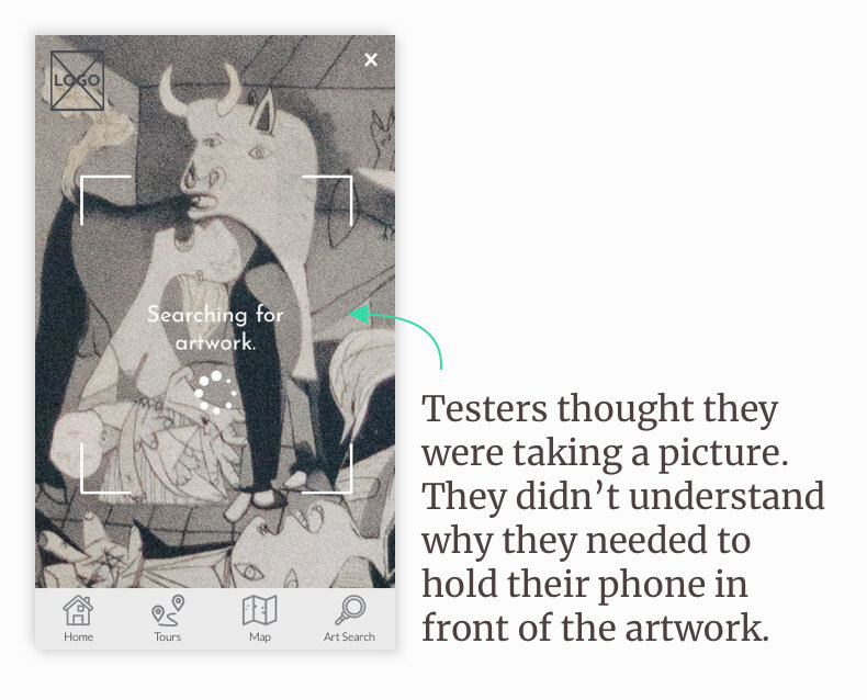
“Why am I taking a picture?”
Users did not understand how to scan with their device and felt that holding their device in front of an artwork was awkward and uncomfortable, both physically and due to social norms.
Muse was updated to leverage traditional search functionality to match users mental models and to feel more comfortable.

“But where is the artwork?”
Users were unsure how to find an artwork and sought more guidance during testing. Wayfinding, leveraging AR and beacon technology, was added to enhance usability and respond to the steps visitors often follow in a gallery.

“What’s a timeline? ‘Read An Artwork’?”
The “Timeline” was renamed “Historical Context.” moved to the main art information page, formatted as a carousel leveraging cards.
“Read an Artwork” was renamed “Art Symbols” and a description was added. Additionally, the functionality of the dots was made clearer through and animation.
Updated task flow
The final task flow was updated to reflect the findings of the usability testing, to allow for great ease of use and access to useful contextual information for Lucie during gallery visits.

Visual Identity
Muse mimics the physical space of many galleries: modern and graphic, using primarily white and black, with a few pops of colour. As Muse is to support the gallery visiting experience, the art is the star.


Key Features

Historical Context
Muse seeks to provides context about artworks and artists for Lucie and other gallery visitors. The historical context timeline provides insights about the time that the artwork was produced, such as historic events, art movements and innovations that were influential to the art community at the time.

Art Symbols
Art Symbols is another feature that supports Lucie’s desire to learn more about an artwork and its context. This feature highlights different elements of an artwork in order to provide more details regarding its significance, from symbolic meaning to what influence the artist.

Wayfinding
When Lucie visits a gallery she wants to know where she can find different pieces, as well as be given recommendations regarding what to see.
Through research, a number of organisations that leverage AR based wayfinding were discovered, such as airports. These were used as inspiration for the wayfinding component of Muse.
Concluding thoughts
Testing is pivotal when developing a new product or feature. Through testing I was able to gain insights to make Muse more useful and intuitive for gallery visitors. To truly understand how a visitor would use Muse to engage and interact in a gallery, further testing of the app in a gallery environment would be essential.
Future Opportunities
Address frustrations with gallery crowding
Design functionality for users and gallery curators to create gallery tours, leveraging AR wayfinding functionality to calculate the best routes and recommended artworks that are nearby
